Developing Logo, Poster and Trailer - Hachiman
- May 17, 2025
- 2 min read
Logo Development
Going into developing the logo for Hachiman, I had ideas for what I wanted from the logo: I wanted something simple with a Japanese-inspired brushstroke font, to fit the aesthetic of the game and wanted to keep colours involved in the logo low, two at most.

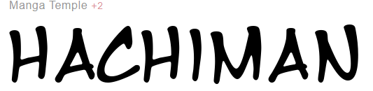


I first tested a number of fonts which had the aesthetic I was looking for, landing on OnsenJapan as the font choice. I kept the logo minimal in design details as I could easily translate it to either be horizontal or vertical to suit what I needed to use it for.
Next up was to determine the colours I’d use, which I did alongside the development of a promotional poster for the game.

I tested a number of different colour combinations here, mainly using a brighter colour such as gold, red or purple alongside a black or white to help outline or vice versa. After looking at the different options myself, alongside asking for preference & feedback from a number of different people, I decided on using the black font with a golden outline. The gold outline helped it stand out from the poster background, as well as black/gold being a good colour combination.

Poster Development
Researching posters of fighting games, a few tropes came up across the different examples I found; characters were often facing off against each other or were in fighting poses, to show off that these characters were fighters and to portray the intensity of the genre or the personalities and rivalries of the characters.


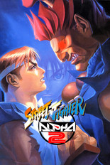


I mocked up a number of examples with the sprites I had access to of my characters, to try and portray & recreate these feelings within my own poster. I took direct inspiration from the Street Fighter Alpha 2 poster, where I had my protagonist directly face off with my antagonist, who was looming over him. This idea I wanted to utilise came across in many of the different poster mock-ups I created.

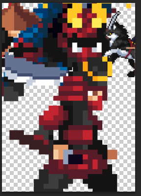

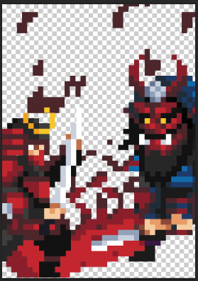


I eventually landed on a composition I liked, which I then shuffled around a bit in order to fit things such as the logo text well.

Trailer Development
Fighting game trailers mainly are used to show off the gameplay and how each of the characters fight, making the formula of a fighting game trailer somewhat simple to create.
I used footage both from playtesting sessions I had recorded as well as some solo footage, in order to show-off my character’s movesets in clear fashion, in order to make the trailer.
I would’ve liked more diverse footage of the game, so that clips would be able to all come from different matches that I had recorded, as well as not having to rely on solo self-recorded footage to show off the character movesets, but unfortunately it was harder to find people to be able to play with in order to record footage, as the game is only 1v1 player-versus-player, meaning I have to have another player in order to get the footage.

Comments